
Dusty Rose Is Having Its Moment, and Persian Crimson Is Already Ahead of It
Zagrosa · Interior Living
A warm interior palette built on crimson, dusty rose, and aged gold is emerging as the defining colour story of the season. It is showing up in Australian living rooms where blush has been retired and something richer, more considered, has taken its place. This is not a trend. It is a correction.
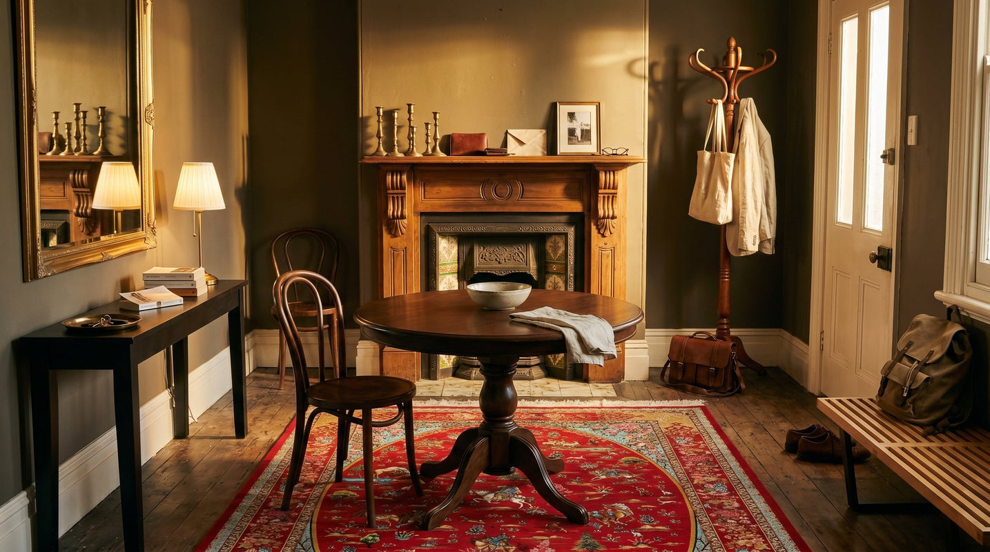
The room does not match, it accumulates, tone by tone, until crimson and rose and gold settle into something that feels entirely inevitable.
He repainted the living room three times in four years, chasing a version of blush that never quite arrived. The fourth colour was not pink at all.
The Blush Era Has Closed
For the better part of a decade, blush pink anchored Australian living rooms with a kind of confident gentleness. Paired with white oak, linen, and soft grey, it produced interiors that felt considered without committing to much. The palette was broadly loved because it was broadly safe.
What is emerging now carries more weight. Australian interiors are shifting toward colour that does not recede, toward tones that hold their ground when the light changes: crimson, dusty rose, terracotta, aged gold. The rooms doing this well are not louder, they are deeper. The distinction matters.
Observable signals of this shift appear across the design accounts followed most closely in Sydney and Melbourne: timber frames darkening toward walnut and blackwood, ceramics moving from chalky matte to earthy gloss, textiles thickening from sheer linen into velvet and woven wool. The floor has changed too. Pale natural-fibre rugs are being replaced by something with pattern, history, and chromatic presence.
Three Tones, Three Surfaces, the Composition That Works
The rooms worth paying attention to in this movement share one structural decision. They layer at least three warm tones across different surfaces rather than landing on a single accent and calling it done. The effect is neither coordinated nor chaotic. It is composed, in the same way a still life is composed: each element carries its own weight, and the relationship between them produces meaning that none could produce alone.
In practice, this looks like a deep terracotta wall sitting behind a timber-framed sofa in honey oak, with a crimson-ground Persian rug holding the floor and a cluster of aged brass on the console. The dusty rose enters in the soft furnishings, a cushion or throw, and functions as the breath between the stronger tones rather than the headline. That distribution of warmth across floor, wall, and vertical surface is what makes the room feel resolved rather than decorated.
The principle here draws from colour theory's understanding of distributed saturation. When a single warm tone carries all the chromatic responsibility in a room, the eye reads it as an accent against neutrality. When warmth appears across three or more surfaces at different intensities, the room itself becomes warm. The difference is atmospheric rather than decorative.
Aged Gold as the Unifying Thread
Across every iteration of this palette, aged gold functions as the through-line. Not yellow gold, not polished brass, but the dimmer, more complex version: honey-toned timber, oxidised brass fixtures, the gilded weft detail woven into Persian medallion grounds.
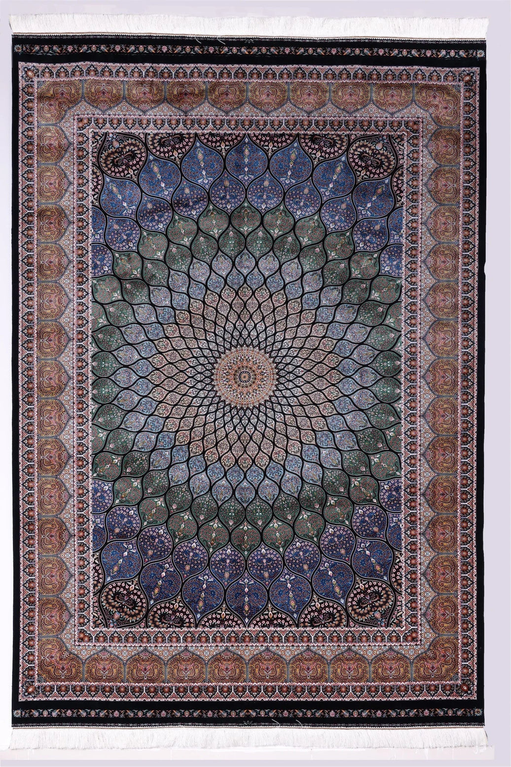
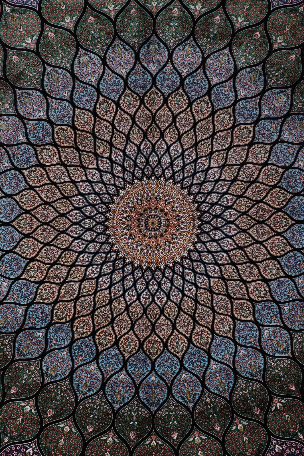
This is where Persian heritage rugs contribute something beyond their visual presence at floor level. The classical Herati and medallion patterns drawn from centuries of weaving tradition carry gold and ochre within their field as structural elements, not ornamental gestures. Laid beneath a warm room, those woven undertones begin a conversation with the brass above them, the timber beside them, the dusty rose across from them. The rug does not match. It corresponds.
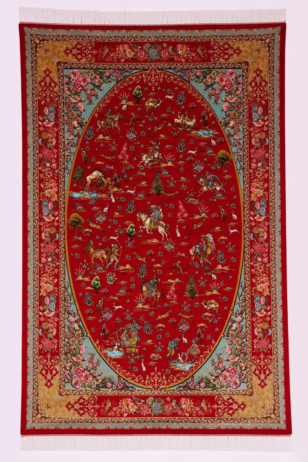
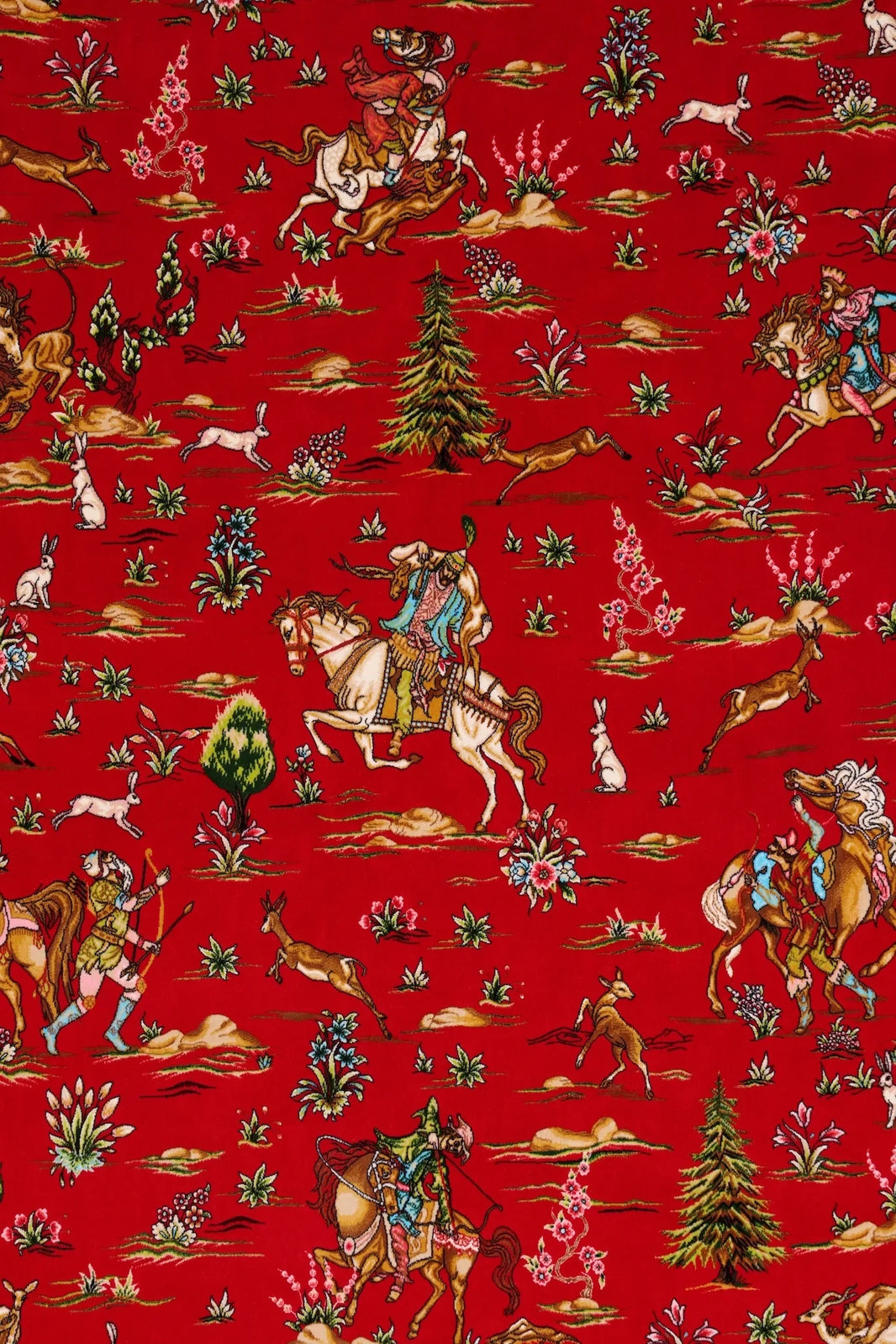
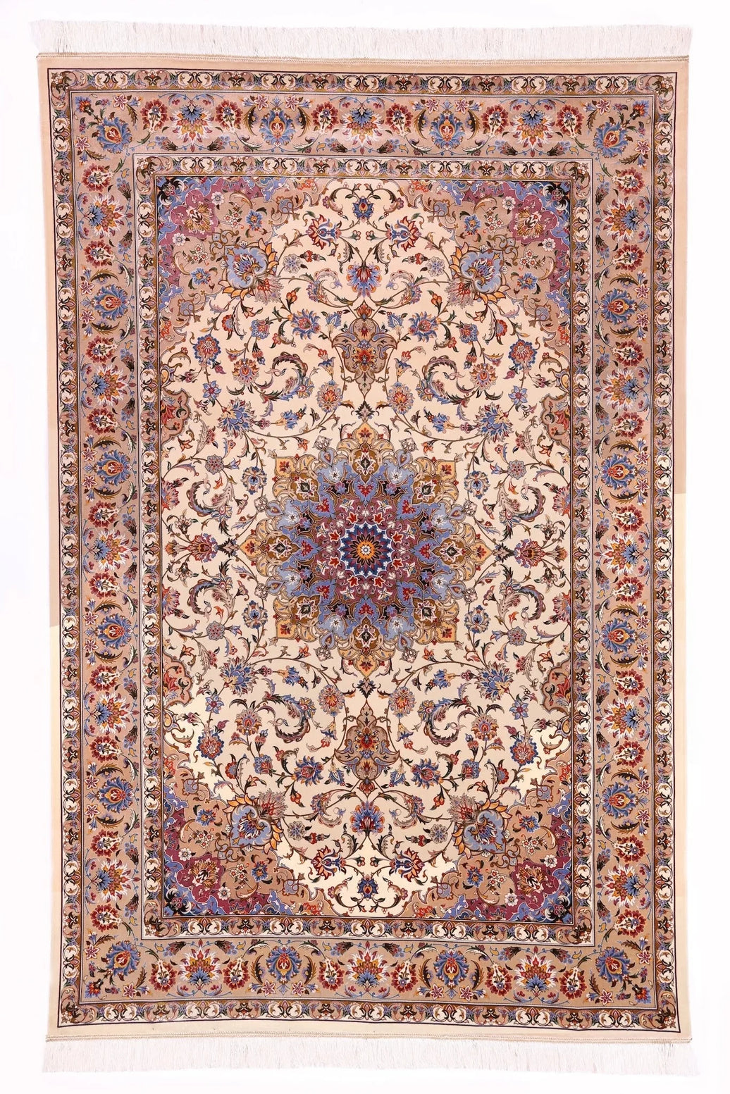
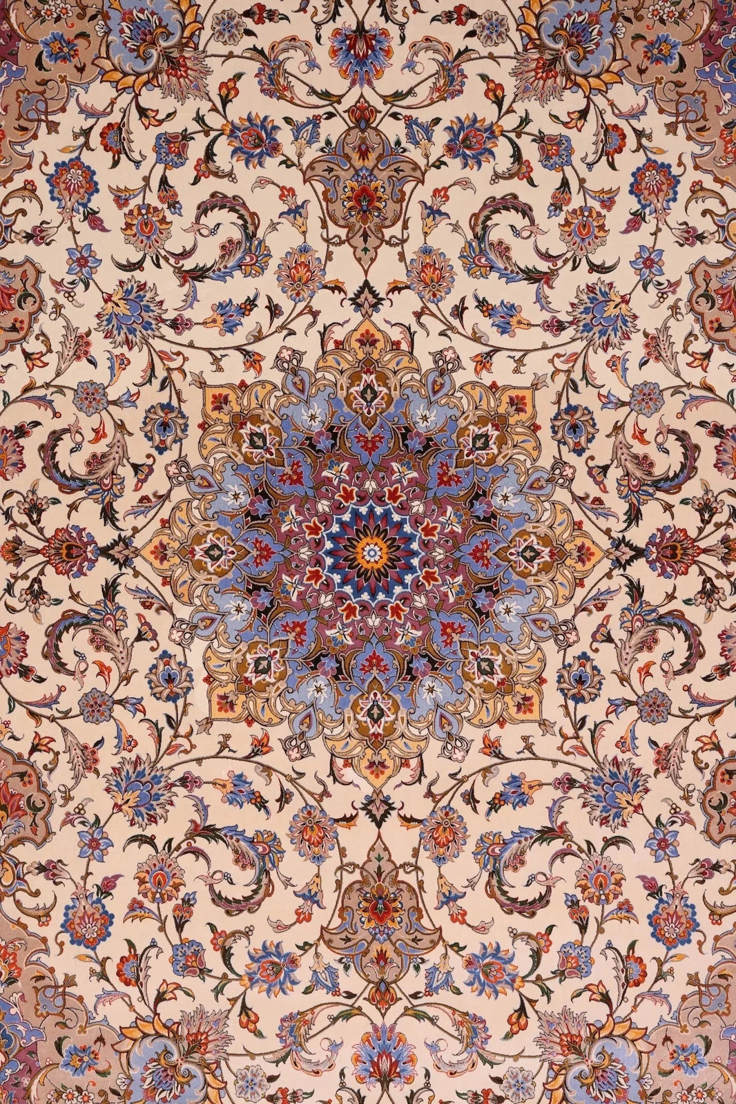
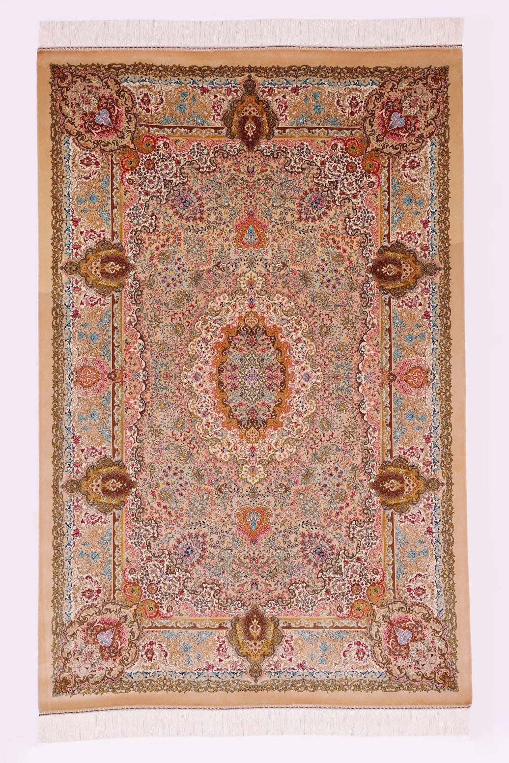
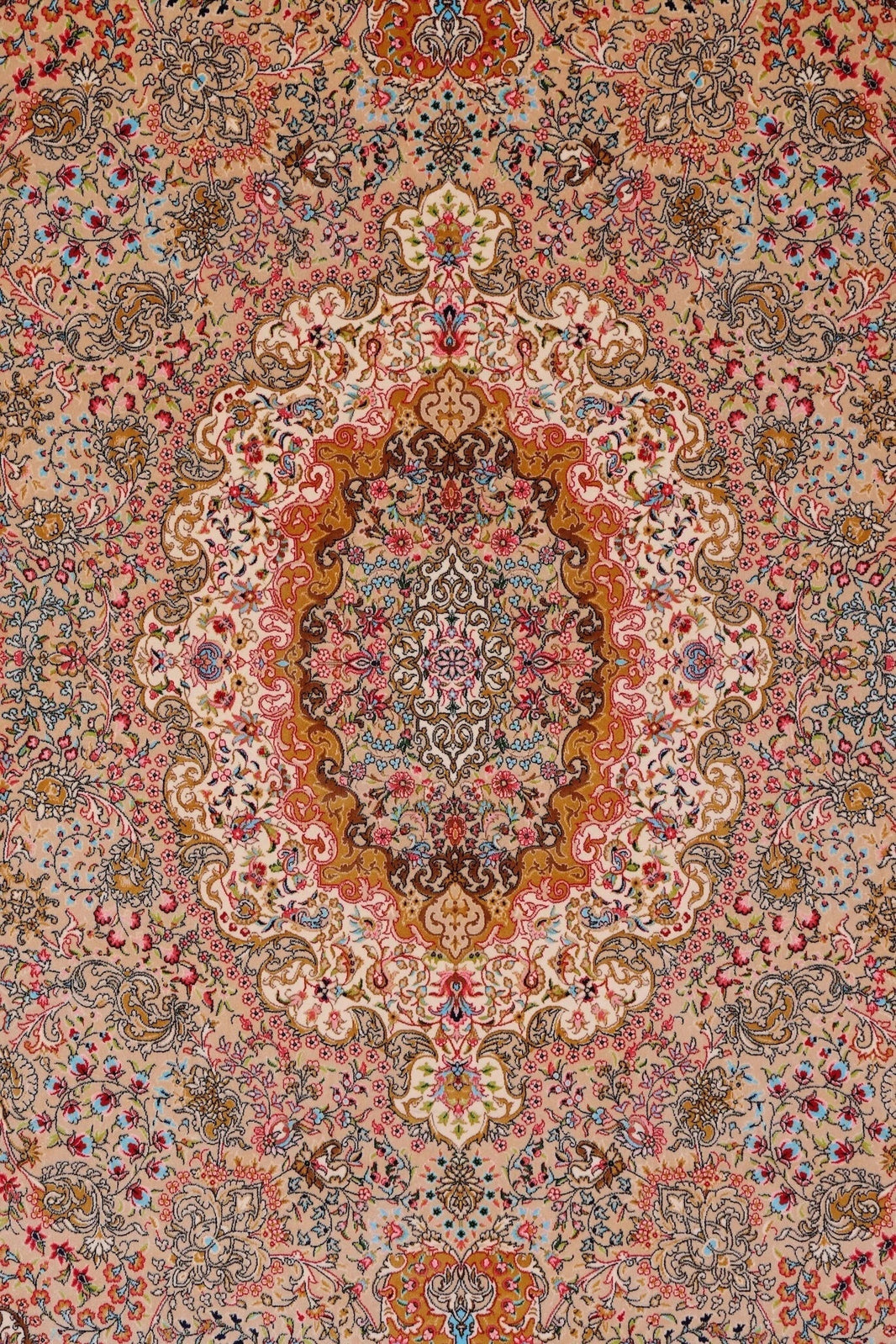
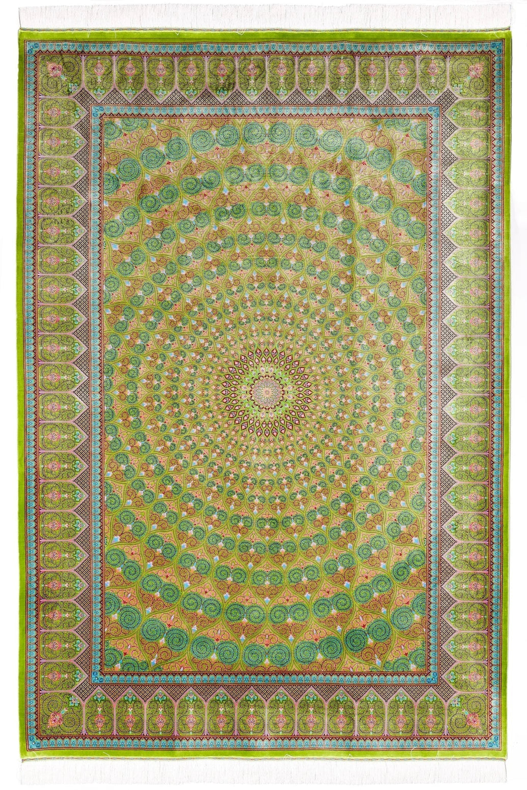
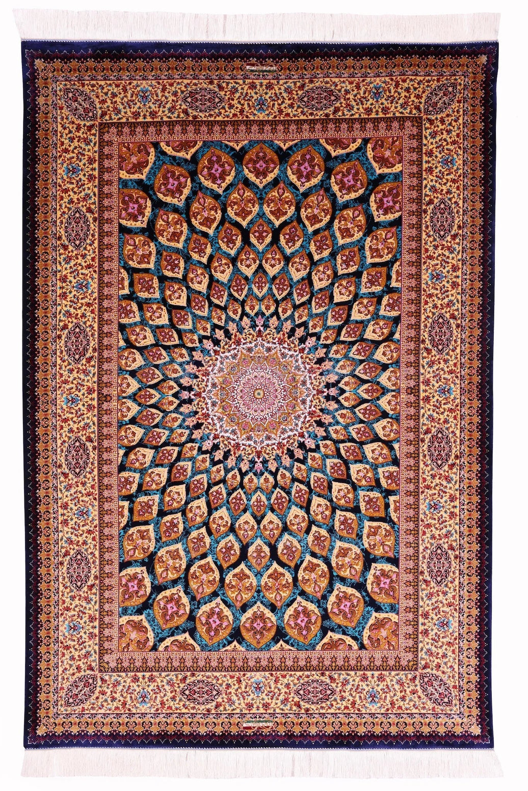
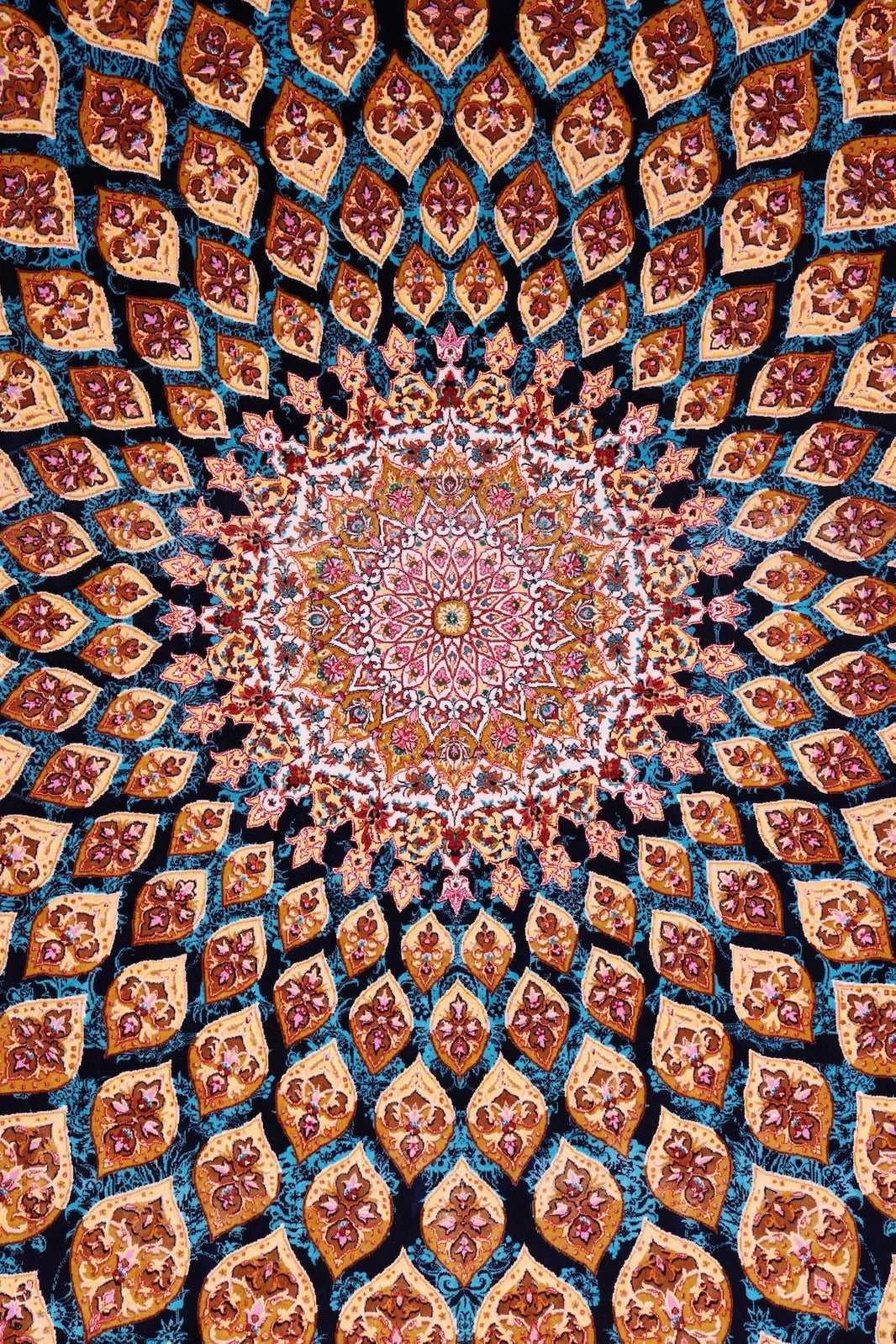
The Ahoo in Red works precisely this way in a room built around deeper warm tones. Its crimson field reads as confident from a distance; closer, the pattern reveals ochre and ivory detailing that surfaces again in whatever warm-toned objects surround it. The rug is not coordinating the room. It is anchoring it, and leaving room for everything else to respond.
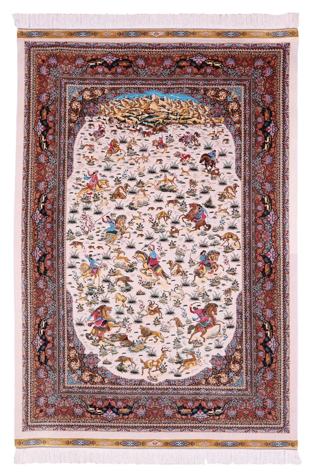
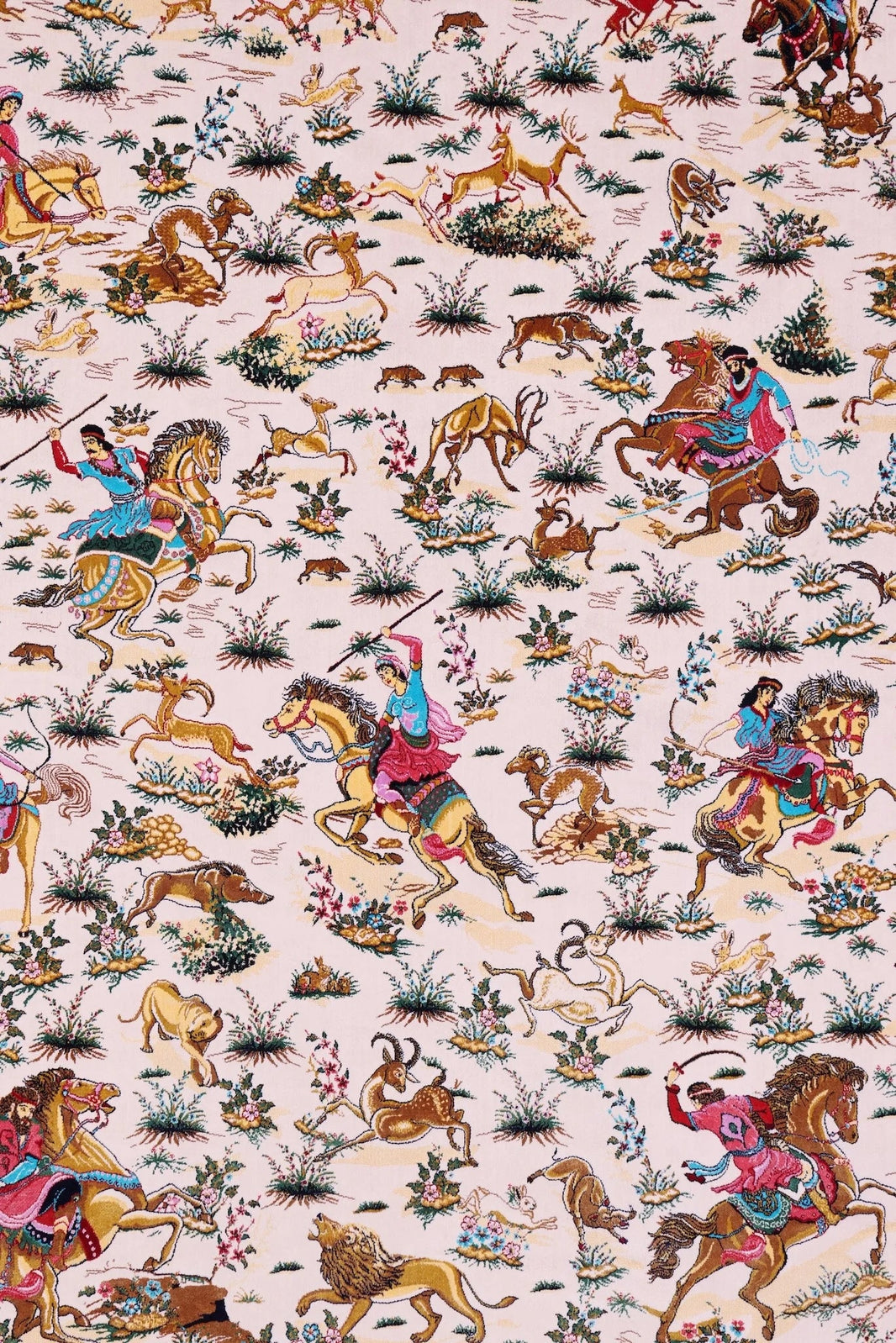
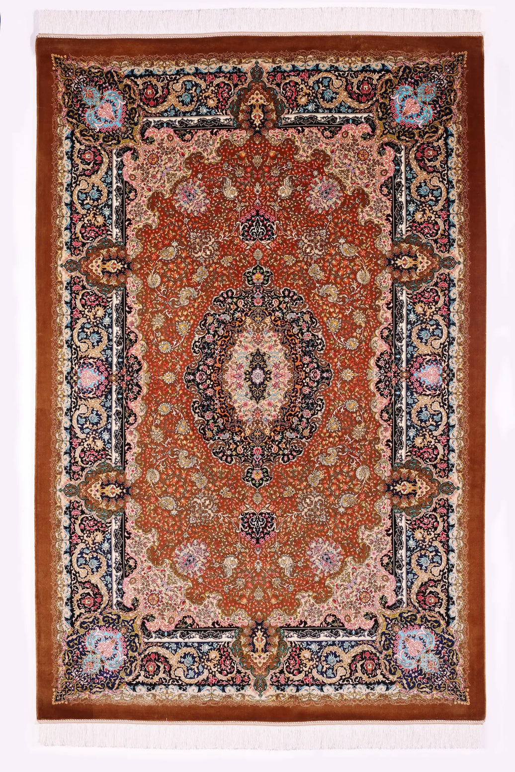
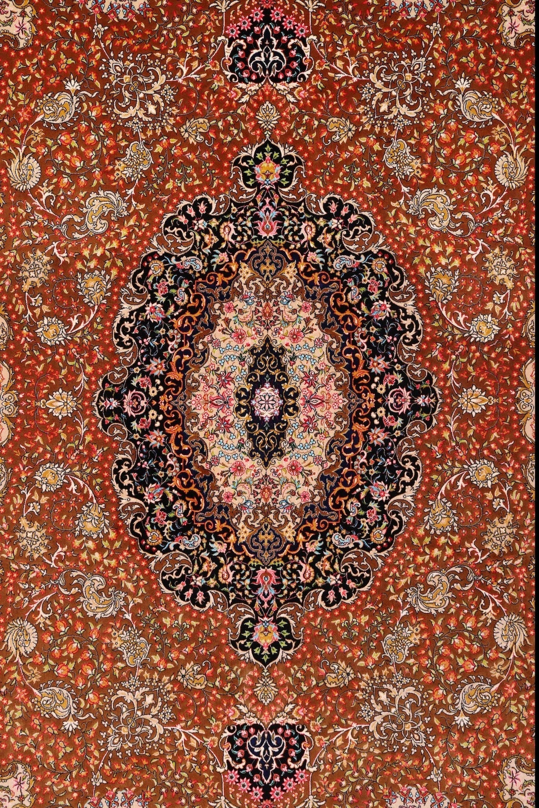
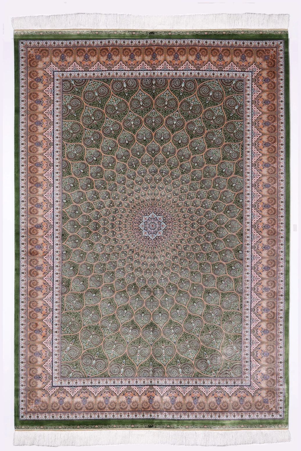
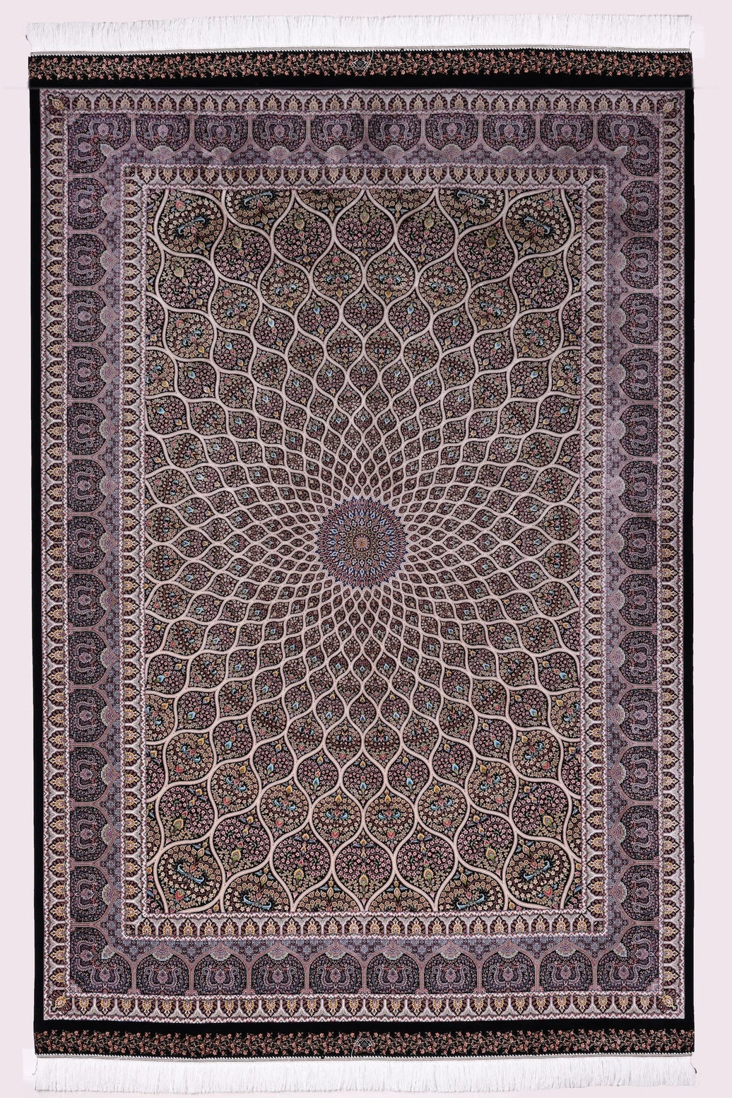
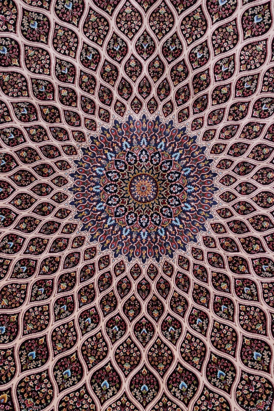
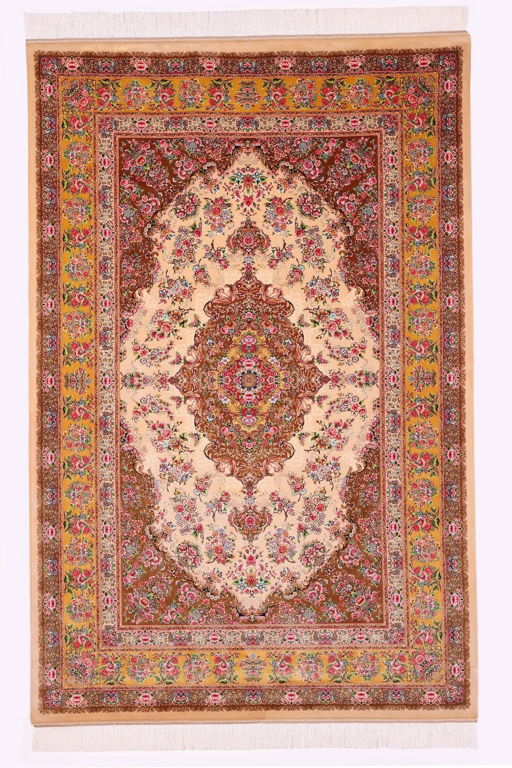
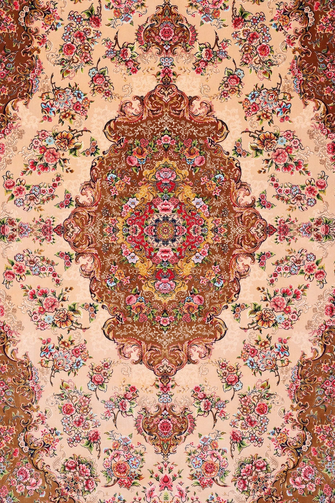
For rooms where the wall tone is already doing significant work, a cinnamon ground reads with less confrontation while losing none of the warmth. The Aylar in Cinnamon sits in this register, its traditional Persian motifs rendered in tones that lean amber and warm stone. Paired with a dusty rose textile overhead and aged timber throughout, it completes the palette at floor level without competing with it.
Where Dusty Rose Actually Belongs in This Palette
The mistake most rooms make is promoting dusty rose to the dominant role. It is a tone built for dialogue, not declaration. In a room where crimson holds the floor and dark timber holds the vertical plane, dusty rose earns its place in the smaller decisions: a linen cushion, a boucle throw, the inside glaze of a ceramic vessel. At that scale, it softens without diluting.
This is a departure from how blush operated in its peak years, where it tended to claim the largest surface in the room and ask everything else to defer. The current movement asks dusty rose to relinquish that authority. The rooms that have made this adjustment feel more layered, more honest about what warmth in an interior actually requires: depth, not dominance.
Designers working in this space are drawing on principles that Persian weavers understood implicitly. A classical rug field does not give equal weight to every tone. It establishes a ground, builds pattern across it in a secondary colour, and introduces accent tones with precise economy. The composition teaches the eye how to move. A room built on the same logic produces the same result.
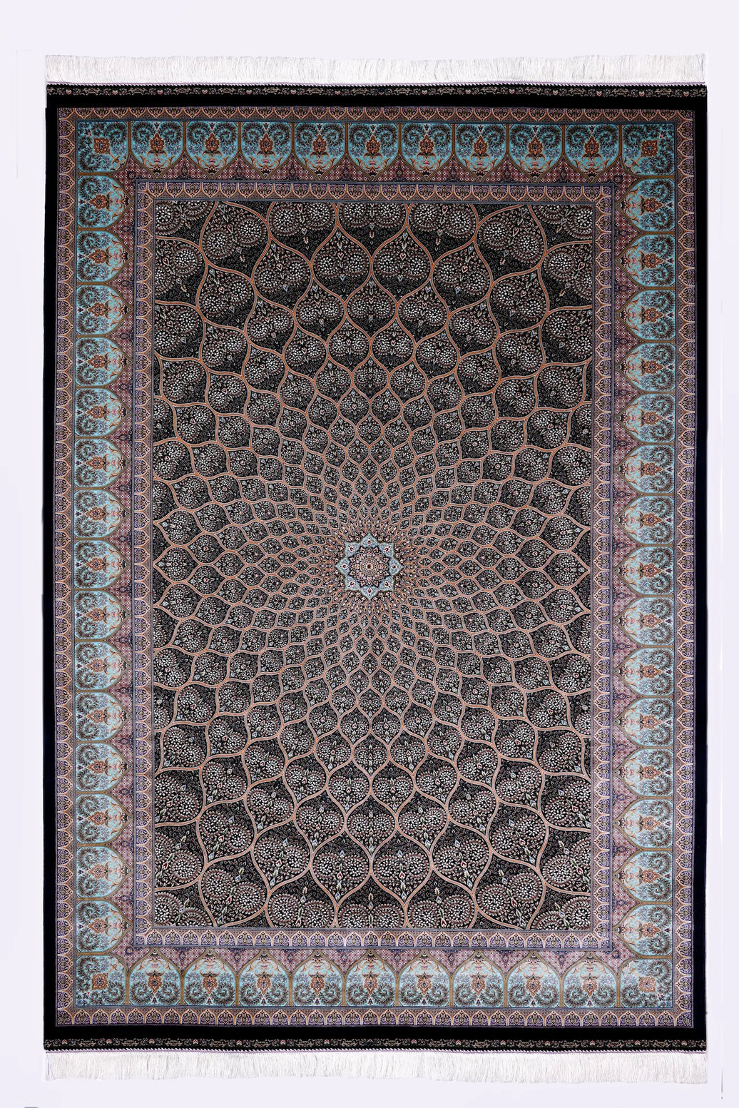
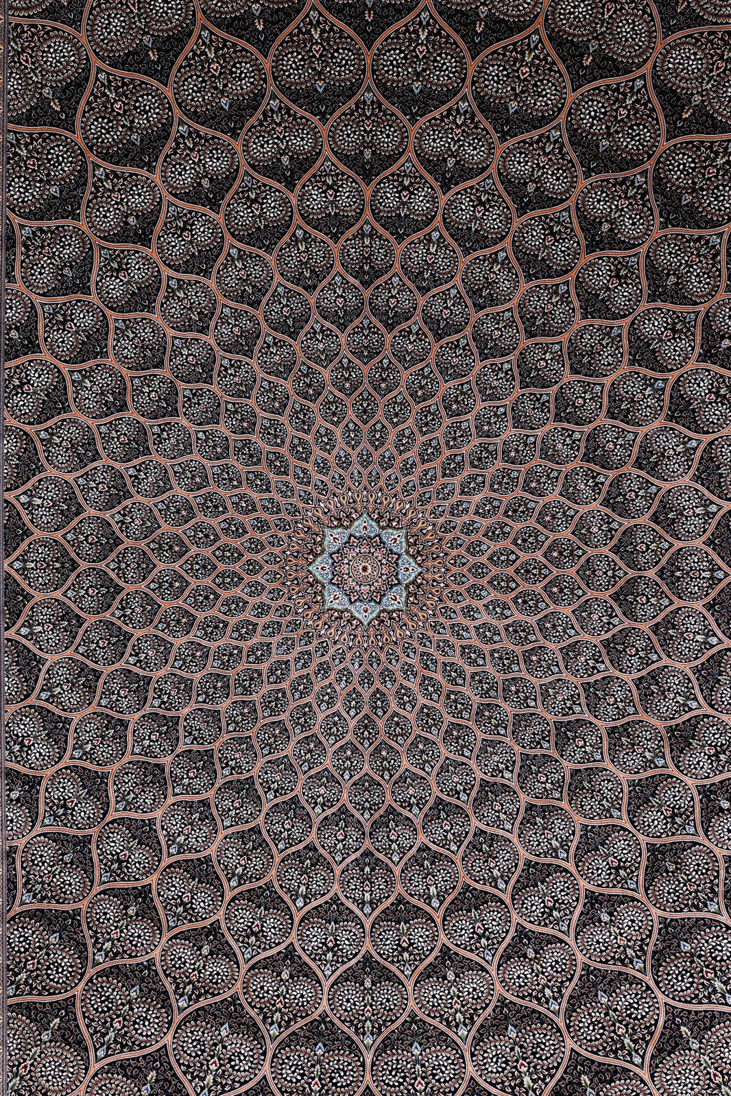
For rooms where the palette runs deeper still, toward aubergine, aged wine, and smoked plum, the Arghavan enters this conversation with authority. Its darker field grounds the warmest rooms without breaking their chromatic logic.
The room that knows its own colours is not a room that matches. It is a room where each element has been chosen for what it contributes to the whole, and nothing is there by accident. That is the principle this palette is built on, and it is precisely why it outlasts the trends that preceded it. As we have written before, layering textiles with real intention is what separates a collected room from a considered one.
The Room This Palette Builds
Australian interiors are not simply moving away from blush. They are moving toward rooms that take colour seriously as a structural decision, not a finishing touch. Crimson at the floor. Dusty rose in the soft furnishings. Aged gold running through timber, ceramics, and the woven field of a Persian rug. Dark wall tone holding the perimeter.
The result is a room that does not perform warmth. It possesses it.
Visualize this rug in your room →
Questions, answered
how do I build a warm interior palette without it looking too coordinated?
Distribute warmth across three or more surfaces at different intensities: crimson at floor level, dusty rose in soft furnishings, aged gold in timber and brass. Each element contributes its own weight. The room becomes warm through this layering, not through matching. That distribution is what makes a space feel composed rather than decorated.
what colour Persian rug works with dusty rose walls?
A crimson or cinnamon ground Persian rug anchors a room where dusty rose already claims vertical space. Crimson reads as confident; cinnamon softens without retreating. Either carries ochre and warm stone tones in its pattern that correspond with surrounding elements, they don't match, they resonate.
why is aged gold the key to layering warm tones?
Aged gold, honey-toned timber, oxidised brass, the ochre weft in Persian patterns, unifies disparate warm tones across a room. Persian rugs carry gold as a structural element woven into their field for centuries. When laid beneath warm interiors, those undertones converse with brass fixtures and timber, binding the palette into coherence.
is dusty rose still relevant for interiors in 2024?
Dusty rose belongs in dialogue, not dominance. It functions as breath between stronger tones, a linen cushion, a ceramic glaze, rather than claiming the largest surface. Rooms that relinquish its former authority feel more layered and honest. The shift reflects how depth, not dominance, now defines warmth.